
The monochromatic makeover
Canonical
on 16 July 2015
Tags: Design , icons , Ubuntu Fonts
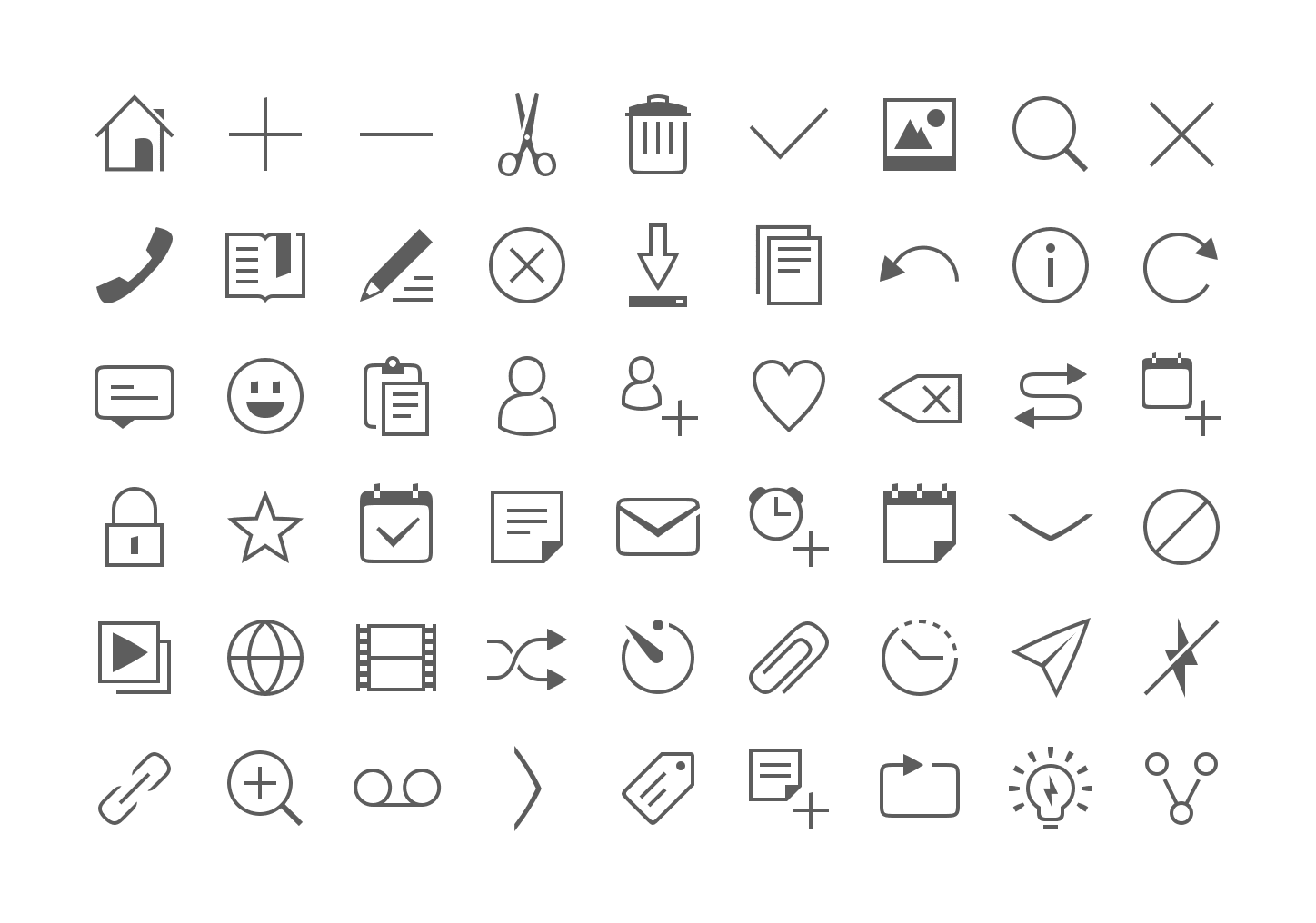
We have given our monochromatic icons a small facelift to make them more elegant, lighter and consistent across the platform by incorporating our Suru language and font style.
The rationale behind the new designs are similar to that of our old guidelines, where we have kept to our recurring font patterns but made them more streamlined and legible with lighter strokes, negative spaces, and a minimal solid shape.
What we have changed:
- Reduced and standardized the strokes width from 6 or 8 pixels to 4.
- Less solid shapes and more outlines.
- The curvature radius of rectangles and squares has been slightly reduced (e.g message icon) to make them less ‘clumsy’.
- Few outlines are ‘broken’ (e.g bookmark, slideshow, contact, copy, paste, delete) for more personality. This negative space can also represent a shadow cast.
Less solid shapes
Before

After

Lighter strokes
Before

After

Negative spaces
Before

After

Font patterns
Oblique lines are slightly curved
Arcs are not perfectly rounded but rather curved

Uppercase letters use right or sharp angles

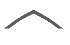
Vertical lines have oblique upper terminations.
Nice soft curves

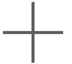
Action
Devices

Indicators

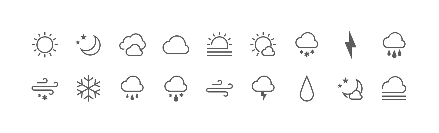
Weather
Talk to us today
Interested in running Ubuntu in your organisation?
Newsletter signup
Related posts
From inspiration to impact: design students from Regent’s University London explore open design for their dissertation projects
Last year, we had the opportunity to speak at Regent’s UX Conference (Regent’s University London’s conference to showcase UX work by staff, students, and...
Showcasing open design in action: Loughborough University design students explore open source projects
Last year, we collaborated with two design student teams from Loughborough University in the UK. These students were challenged to work on open source project...
Design and Documentation clinics at FOSDEM Fringe 2026
FOSDEM is one of the biggest and most exciting open source events of the year, held at the Solbosch campus of the Université Libre de Bruxelles (Brussels),...